Getting and using data from the PCT
Robin Lovelace, Joey Talbot and Nathanel Sheehan
Source:vignettes/getting.Rmd
getting.RmdThe PCT is not only a web tool, it is a research and open data project that has resulted in many megabytes of valuable data (Lovelace et al. 2017). This guide was put together to show how to download and use these open datasets, originally for the Cycle Active City 2021 conference, although it may be of use to anyone interested in data driven planning for sustainable and active travel futures. It was presented as a workshop at the Cycle City Active City 2021 and is divided into the following two main components, which take around an hour each to work through (longer if you’re not experienced with spatial data with R):
- Propensity to Cycle Tool: getting and using the data, based on section 1
- Propensity to Cycle Tool: build your own scenarios, based on section 2
To see the workshop and work through it alongside a video demo, see https://www.youtube.com/watch?v=OiLzjrBMQmU. To see the ‘marked up’ contents of the vignette (with results evaluated) see https://rpubs.com/RobinLovelace/829902.
1 Getting and exploring PCT data
In this section you will learn about the open datasets provided by the PCT project and how to use them. While the most common use of the PCT is via the interactive web application hosted at www.pct.bike, there is much value in downloading the data, e.g. to identify existing cycling infrastructure in close proximity to routes with high potential, and to help identify roads in need of interventions from a safety perspective, using data from the constantly evolving and community-driven global geographic database OpenStreetMap (OSM) (Barrington-Leigh and Millard-Ball 2017).
In this session, which assumes you have experience using QGIS or R, you will learn how to:
- Find data on travel behaviour from the 2011 Census and from the School Census
- How to download and import data from the PCT into QGIS
- How to process the data alongside infrastructure data, to help find gaps in the network
1.1 Getting PCT data from the PCT website
In this example we will use data from North Yorkshire, a mixed region containing urban areas such as York and many rural areas. You can use the PCT, which works at the regional level, for North Yorkshire or any other region by clicking on the area you’re interested in on the main map at https://www.pct.bike. If you know the URL of the region you’re interested in, you can navigate straight there, in this case by typing in or clicking on the link https://www.pct.bike/m/?r=north-yorkshire.
From there you will see a map showing the region. Before you download and use PCT data, it is worth exploring it on the PCT web app.
Exercise: explore the current level and distribution of cycling:
- Explore different data layers contained in the PCT by selecting different options from the dropdown menus on the right.
- Look at the different types of Cycling Flows options and consider: which visualisation layer is most useful?
1.1.1 Using ‘Freeze Lines’
You can use the little-known ‘Freeze Lines’ functionality in the PCT’s web app to identify the zone origin and destinations of trips that would use improvements in a particular place. You can do this by selecting the Fast Routes option from the Cycling Flows menu, zooming into the area of interest, and then clicking on the Freeze Lines checkbox to prevent the selected routes from moving when you zoom back out.
- Use this technique to find the areas that would benefit from improved cycling provision on Clifton bridge, 1 km northwest from central York over the River Ouse (see result in Figure 1.1)
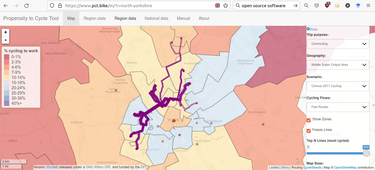
Figure 1.1: Areas that may benefit from improved cycle provision on Clifton Bridge, according to the PCT.
1.2 Downloading data from the PCT in GeoJSON form
On the PCT web app Click on the Region data tab, shown in the top of Figure 1.1, just beneath the ‘north’ in the URL. You should see a web page like that shown in Figure 1.2, which highlights the Region data table alongside the Map, Region stats, National Data, Manual, and About page links.
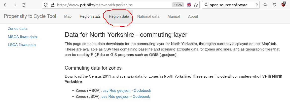
Figure 1.2: The Region data tab in the PCT.
1.3 Visualising PCT data in QGIS
In this section we assume you have a recent version of QGIS installed and have some experience using this popular and powerful free and open source desktop GIS software.1 Open QGIS and create a new project and name it pctdemo.
Once in the project, open the three layers you downloaded in the previous section. You should see something resembling the screenshot shown in Figure 1.3.2

Figure 1.3: Three PCT layers visualised in QGIS.
After you have the data in QGIS as shown in Figure 1.3 a wide range of analysis options are opened up. We can only cover a few of these in here, due to space and time constraints, and it is worth being guided by local policy priorities rather than the technology to ensure useful (not just attractive or eye-catching) results. One major issue that is apparent in Figure 1.3 is that the zones seem squashed.3 We can deal with this by changing the coordinate reference system (CRS) of the map visualisation. It may also be worth reprojecting the data, to the official projected CRS in the UK: EPSG:27700. Undertake these tasks in the exercises below:
- Change the CRS of the map to EPSG:27700 by clicking on the CRS button in the bottom right of the map, just to the right of the Render text in the figures above
- Save each of the layers in this same CRS by right clicking on the layer, selecting Export, and setting the CRS there (take care to export the data into the same folder that the project is in)
1.4 Comparing PCT data with transport network data
Find all the fast routes that intersect with a 10 m buffer surrounding Clifton Bridge (note: this is a time consuming task).4
Don’t worry if you do not have time to complete each of the steps needed to find the result.
You can see how it works by opening the project pctqgis3.qgz in the pctqgis.zip file from https://github.com/ITSLeeds/pct/releases/download/0.8.0/pctqgis.zip.
The result should look something like the screenshot shown in Figure 1.4.

Figure 1.4: All fast routes that intersect with Clifton Bridge in QGIS.
What is the difference between the route data shown in QGIS in Figure 1.4 and the route data shown in the PCT web app in Figure 1.1?
Bonus: How many km of cycling per day could improvement to Clifton Bridge benefit?
Advanced: What interventions would you recommend on Clifton Bridge? Your answer can be based on the analysis presented above, StreetView (see the bridge at goo.gl/maps/Zeq76RnZ9ENRWCsE6) local knowledge and other factors.
Feel free to post any answers/questions about this question in the open access ‘Issue Tracker’ where these materials were developed (requires a GitHub account): https://github.com/ITSLeeds/pct/issues
1.5 Identifying gaps in the network
This section assumes you have data on the regional cycle network.
For the purposes of this worked example, we used a broad definition of ‘cycle infrastructure’ based on research undertaken at the University of Heidelberg.
Using this definition, a cycle infrastructure layer was extracted from OSM using R.
The data was exported from R into the cycle_infra_projected.gpkg, which is provided in the pctqgis.zip file mentioned in the previous sections.
In this section we will load the cycle infrastructure layer, buffer it, and undertake a geographic operation to identify places where there are gaps in the network.
- Load the
cycle_infra_projected.gpkgdataset - Buffer it to 100 m
- Clip the route network layer to include only areas outside the buffer

Figure 1.5: Route network layer and buffer representing cycle infrastructure, to identify gaps in the network.
1.6 Getting PCT data with R
We will get the same PCT datasets as in previous sections but using the R interface.
If you have not already done so, you will need to install the R packages we will use for this section (and the next) by typing and executing the following command in the R console: install.packages("pct", "sf", "dplyr", "tmap").
- After you have the necessary packages installed, the first stage is to load the packages we will use:
library(pct)
library(sf)          # key package for working with spatial vector data
library(tidyverse)   # in the tidyverse
library(tmap)        # installed alongside mapview
tmap_options(check.and.fix = TRUE) # tmap setting- We are now ready to use R to download PCT data. The following commands set the name of the region we are interested in (to avoid re-typing it many times) and download commute data for this region, in the four main forms used in the PCT:
region_name = "north-yorkshire"
zones_all = get_pct_zones(region_name)
lines_all = get_pct_lines(region_name)
# note: the next command may take a few seconds
routes_all = get_pct_routes_fast(region_name)
rnet_all = get_pct_rnet(region_name)- Check the downloads worked by plotting them:
plot(zones_all$geometry)
plot(lines_all$geometry, col = "blue", add = TRUE)
plot(routes_all$geometry, col = "green", add = TRUE)
plot(rnet_all$geometry, col = "red", lwd = sqrt(rnet_all$bicycle), add = TRUE)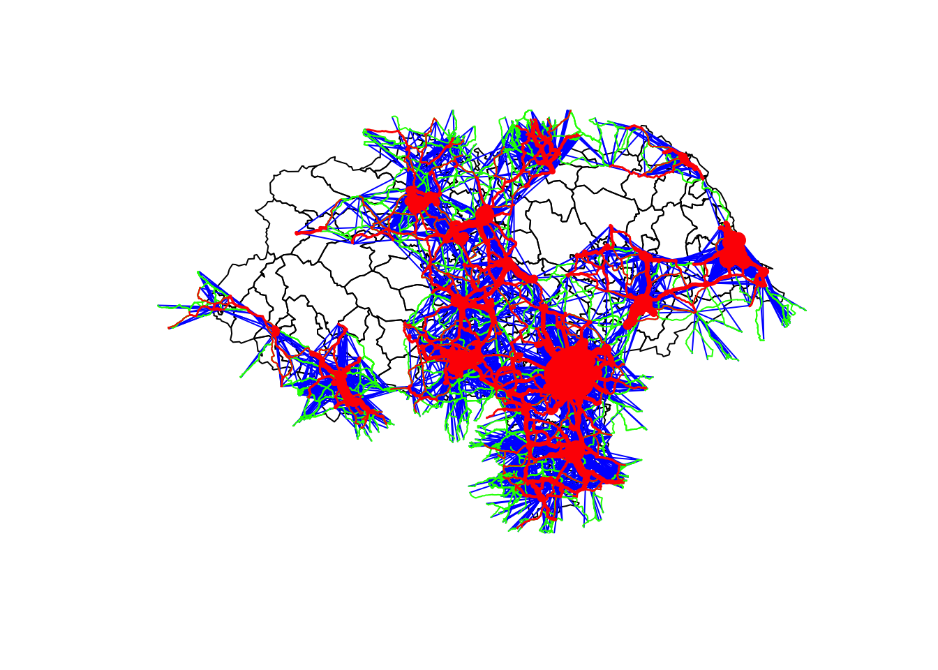
1.7 Getting school route network data
The PCT provides a school route network layer that can be especially important when planning cycling interventions in residential areas (Goodman et al. 2019). Due to the sensitive nature of school data, we cannot make route or OD data level data available. However, the PCT provides travel to school data at zone and route network levels, as shown in Figure 1.6. (Note: to get this data from the PCT website you must select School travel in the Trip purpose menu before clicking on Region data.)
- Get schools data from the PCT with the following commands
zones_school = get_pct_zones(region = region_name, purpose = "school")
rnet_school = get_pct_rnet(region = region_name, purpose = "school")
As we will see in Section 3, combining school and commute network data can result in a more comprehensive network.
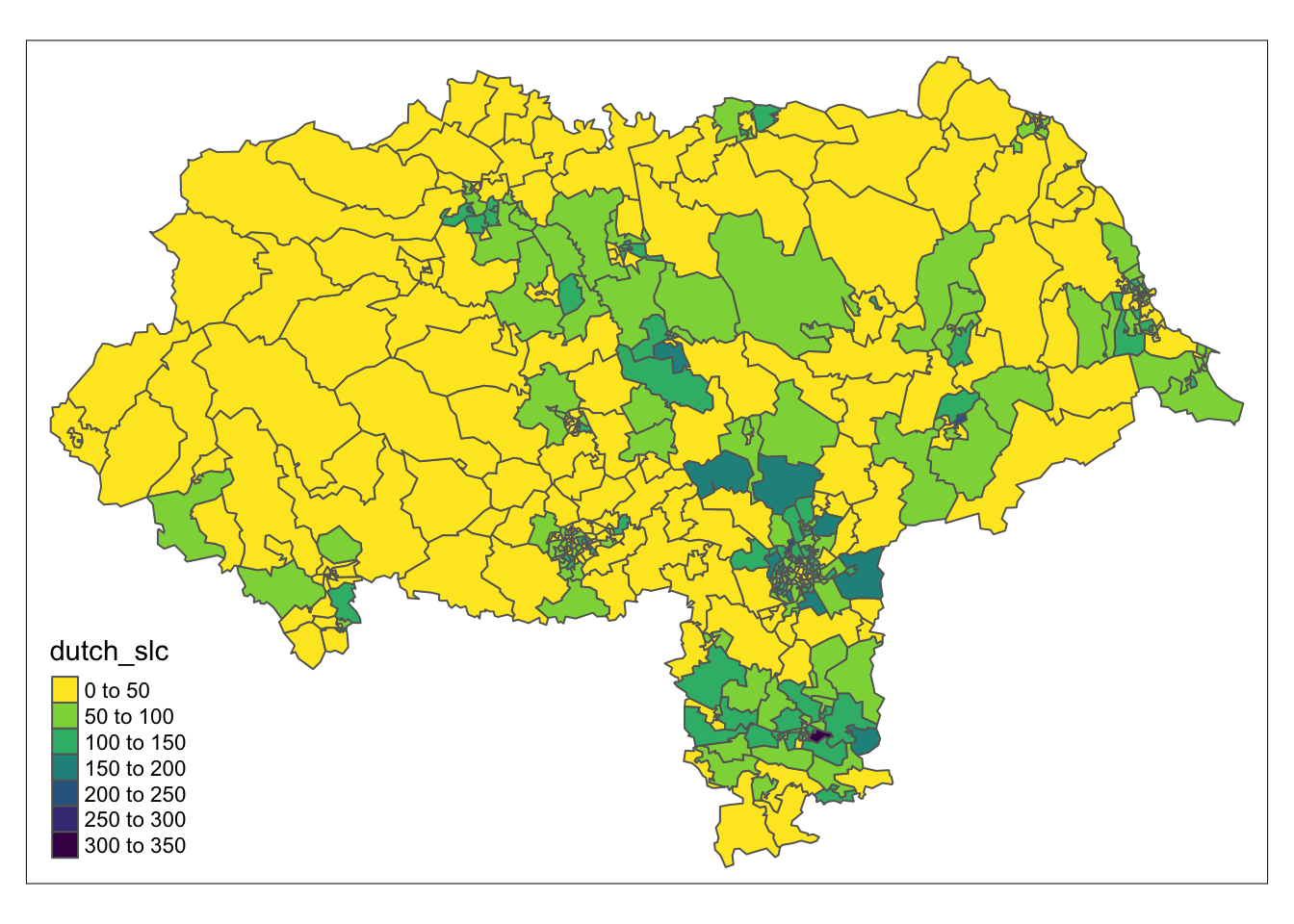
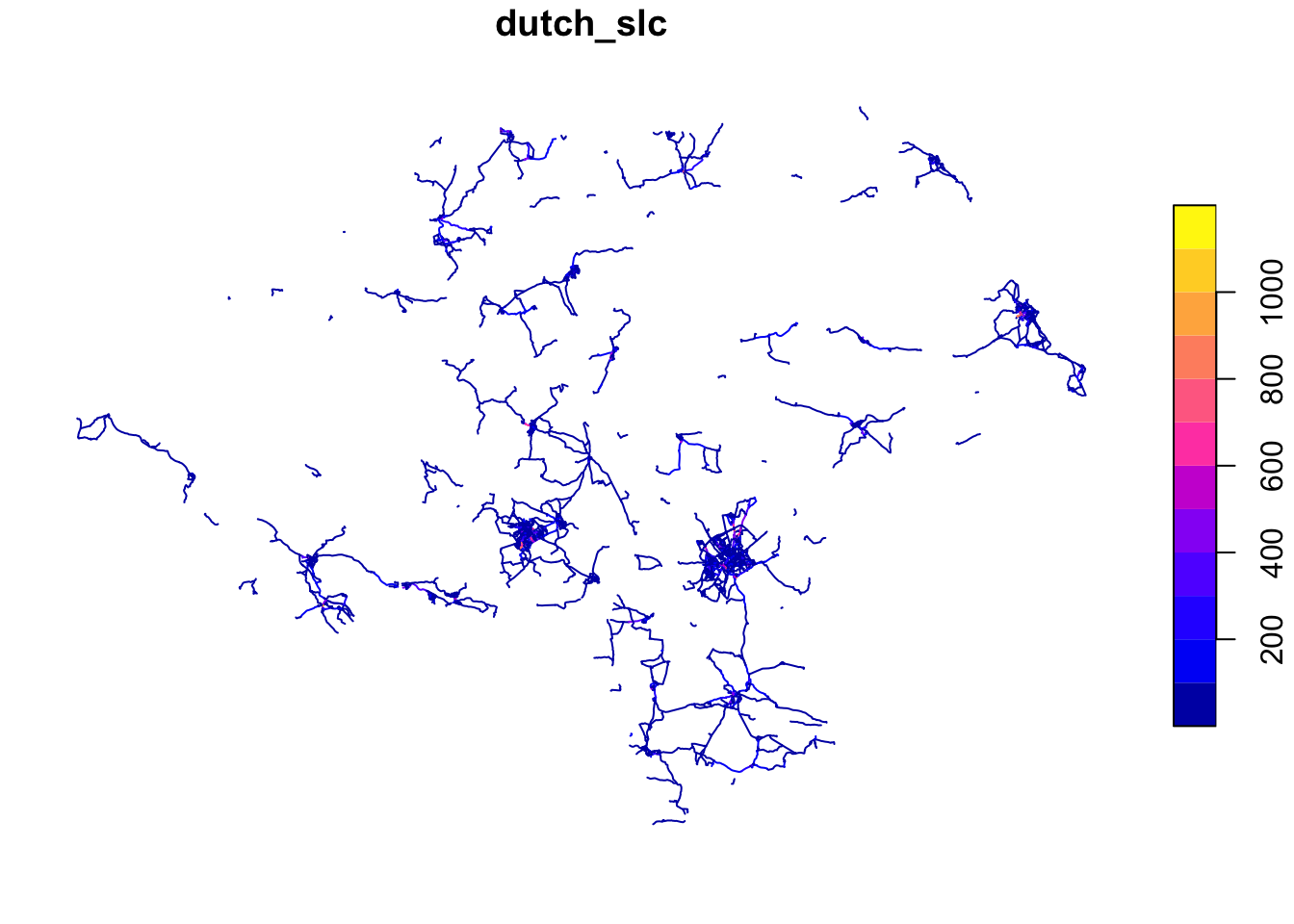
Figure 1.6: Open access data on cycling to school potential from the PCT, at zone (left) and route network (right) levels. These datasets can support planning interventions, especially ‘safe routes to school’ and interventions in residential areas. To see the source code that generates these plots, see the ‘source’ link at the top of the page.
2 Modelling change
This section is designed for people with experience with the PCT and cycling uptake estimates who want to learn more about how uptake models work and how to generate new scenarios of change. Reproducible and open R code will be used to demonstrate the concepts so knowledge of R or other programming languages is recommended but not essential, as there will be conceptual exercises covering the factors linked to mode shift. In it you will:
- Learn about the uptake model underlying the Propensity to Cycle Tool scenarios
- Develop your own uptake model in conceptual terms, e.g., to represent the government’s aim for 50% of all trips in towns and cities to be made by walking and cycling by 2030
- Learn how to train uptake models against data, to build evidence-based uptake models
2.1 Set-up
To undertake the exercises in this section you need to have R and RStudio installed, as outlined here.
Load the packages by running each of the lines of code in the code chunk beginning with library(pct) (which loads the pct R package, making its functions available) in the previous section 1.6.
To complete the exercises in this workshop your also need to have imported PCT data into your R session, by running each line of code in the code chunk beginning region_name = "north-yorkshire" in the previous section.
Finally, we will use these additional packages, which you must have installed on your computer for the code below to work:
2.2 PCT scenarios
- Generate a ‘Go Dutch’ scenario for the North Yorkshire using the function
uptake_pct_godutch()(hint: the following code chunk will create a ‘Government Target’ scenario):
lines_all$pcycle = lines_all$bicycle / lines_all$all
lines_all$euclidean_distance = as.numeric(sf::st_length(lines_all))
lines_all$pcycle_govtarget = uptake_pct_govtarget_2020(
  distance = lines_all$rf_dist_km,
  gradient = lines_all$rf_avslope_perc
  ) * 100 + lines_all$pcycle
## Min. 1st Qu. Median Mean 3rd Qu. Max.
## 0.505 6.881 20.750 22.367 36.265 56.052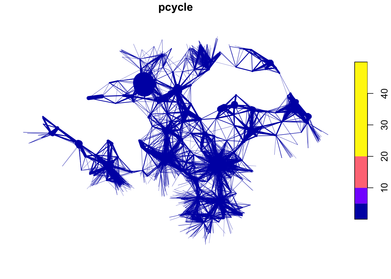
(#fig:dutch_pcycle)Percent cycling currently (left) and under a ‘Go Dutch’ scenario (right) in the North Yorkshire.
- Think of alternative scenarios that would be useful for your work
- Advanced: look at the source code of the function
pct_uptake_godutch()- how could it be modified?
2.3 Developing new scenarios of change
Let’s develop a simple model representing the government’s aim, that “half of all journeys in towns and cities will be cycled or walked” by 2030. We will assume that this means that all journeys made in urban areas, as defined by the Office for National Statistics, will be made by these active modes. We only have commute data in the data we downloaded, but this is a good proxy for mode share overall.
The first stage is to identify urban areas in North Yorkshire. We use data from the House of Commons Research Briefing on City and Town Classifications to define areas based on their town/city status. The code chunk below shows the benefits of R in terms of being able to get and join data onto the route data we have been using:
# Get data on the urban_rural status of LSOA zones
urban_rural = readr::read_csv("https://researchbriefings.files.parliament.uk/documents/CBP-8322/oa-classification-csv.csv")
ggplot(urban_rural) +
  geom_bar(aes(citytownclassification)) +
  coord_flip()

# summary(routes_all$geo_code1 %in% urban_rural$lsoa_code)

# Join this with the PCT commute data that we previously downloaded
urban_rural = rename(urban_rural, geo_code = lsoa_code)
zones_all_joined = left_join(zones_all, urban_rural)
routes_all_joined = left_join(routes_all, urban_rural, by = c("geo_code1" = "geo_code"))
tm_shape(zones_all_joined) +
  tm_polygons("citytownclassification")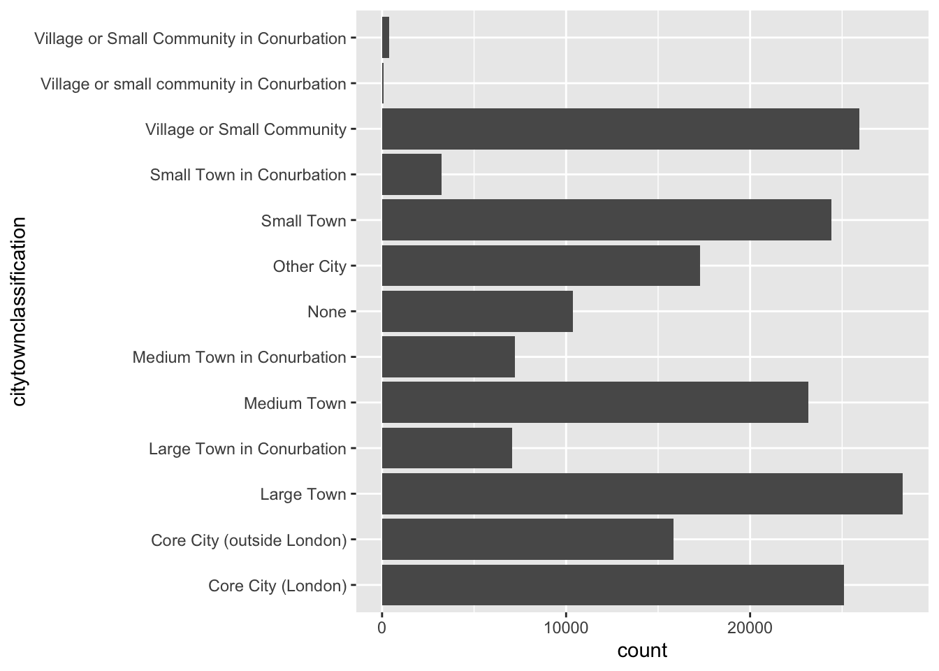
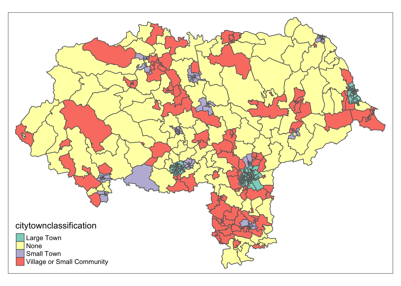
Figure 2.1: Classification of areas in Great Britain (left) and North Yorkshire (right).
After the classification dataset has been joined, the proportion of trips made by walking and cycling in towns and cities across North Yorkshire can be calculated as follows.
# Select only zones for which the field `citytownclassification` contains the word "Town" or "City"
routes_towns = routes_all_joined %>%
  filter(grepl(pattern = "Town|City", x = citytownclassification))
round(sum(routes_towns$foot + routes_towns$bicycle) / sum(routes_towns$all) * 100)
## [1] 34Currently, only around 34% of commute trips in the region’s ‘town’ areas are made by walking and cycling (27% across all zones in North Yorkshire, and a much lower proportion in terms of distance). We explore this in more detail by looking at the relationship between trip distance and mode share, as shown in Figure 2.2 (a). We will create a scenario representing the outcome of policies that incentivise people to replace car trips with walking and cycling, focussing on the red boxes in Figure 2.2. The scenario will replace 50% of car trips of less than 1 km with walking and 10% of trips between 1 km and 2 km in distance. The remaining car trips will be replaced by cycling, with the percentages of trips that switch for each OD determined by the uptake function in the Go Dutch Scenario of the PCT, resulting in the graphic shown in Figure 2.2 (b).
# Reduce the number of transport mode categories
routes_towns_recode = routes_towns %>%
  mutate(public_transport = train_tube + bus,
         car = car_driver + car_passenger,
         other = taxi_other + motorbike
         ) %>%
  dplyr::select(-car_driver, -car_passenger, -train_tube, -bus)

# Set distance bands to use in the bar charts
routes_towns_recode$dist_bands = cut(x = routes_towns_recode$rf_dist_km, breaks = c(0, 1, 3, 6, 10, 15, 20, 30, 1000), include.lowest = TRUE)

# Set the colours to use in the bar charts
col_modes = c("#fe5f55", "grey", "#ffd166", "#90be6d", "#457b9d")

# Plot bar chart showing modal share by distance band for existing journeys
base_results = routes_towns_recode %>%
  sf::st_drop_geometry() %>%
  dplyr::select(dist_bands, car, other, public_transport, bicycle, foot) %>%
  tidyr::pivot_longer(cols = matches("car|other|publ|cy|foot"), names_to = "mode") %>%
  mutate(mode = factor(mode, levels = c("car", "other", "public_transport", "bicycle", "foot"), ordered = TRUE)) %>%
  group_by(dist_bands, mode) %>%
  summarise(Trips = sum(value))
g1 = ggplot(base_results) +
  geom_col(aes(dist_bands, Trips, fill = mode)) +
  scale_fill_manual(values = col_modes) + ylab("Trips")
g1

# Create the new scenario:
# First we replace some car journeys with walking, then replace some of the
# remaining car journeys with cycling
routes_towns_recode_go_active = routes_towns_recode %>%
  mutate(
    foot_increase_proportion = case_when(
      # specifies that 50% of car journeys <1km in length will be replaced with walking
      rf_dist_km < 1 ~ 0.5,
      # specifies that 10% of car journeys 1-2km in length will be replaced with walking
      rf_dist_km >= 1 & rf_dist_km < 2 ~ 0.1,
      TRUE ~ 0
      ),
    # Specify the Go Dutch scenario we will use to replace remaining car trips with cycling
    bicycle_increase_proportion = uptake_pct_godutch_2020(distance = rf_dist_km, gradient = rf_avslope_perc),
    # Make the changes specified above
    car_reduction = car * foot_increase_proportion,
    car = car - car_reduction,
    foot = foot + car_reduction,
    car_reduction = car * bicycle_increase_proportion,
    car = car - car_reduction,
    bicycle = bicycle + car_reduction
    )

# Plot bar chart showing how modal share has changed in our new scenario
active_results = routes_towns_recode_go_active %>%
  sf::st_drop_geometry() %>%
  dplyr::select(dist_bands, car, other, public_transport, bicycle, foot) %>%
  tidyr::pivot_longer(cols = matches("car|other|publ|cy|foot"), names_to = "mode") %>%
  mutate(mode = factor(mode, levels = c("car", "other", "public_transport", "bicycle", "foot"), ordered = TRUE)) %>%
  group_by(dist_bands, mode) %>%
  summarise(Trips = sum(value))
g2 = ggplot(active_results) +
  geom_col(aes(dist_bands, Trips, fill = mode)) +
  scale_fill_manual(values = col_modes) + ylab("Trips")
g2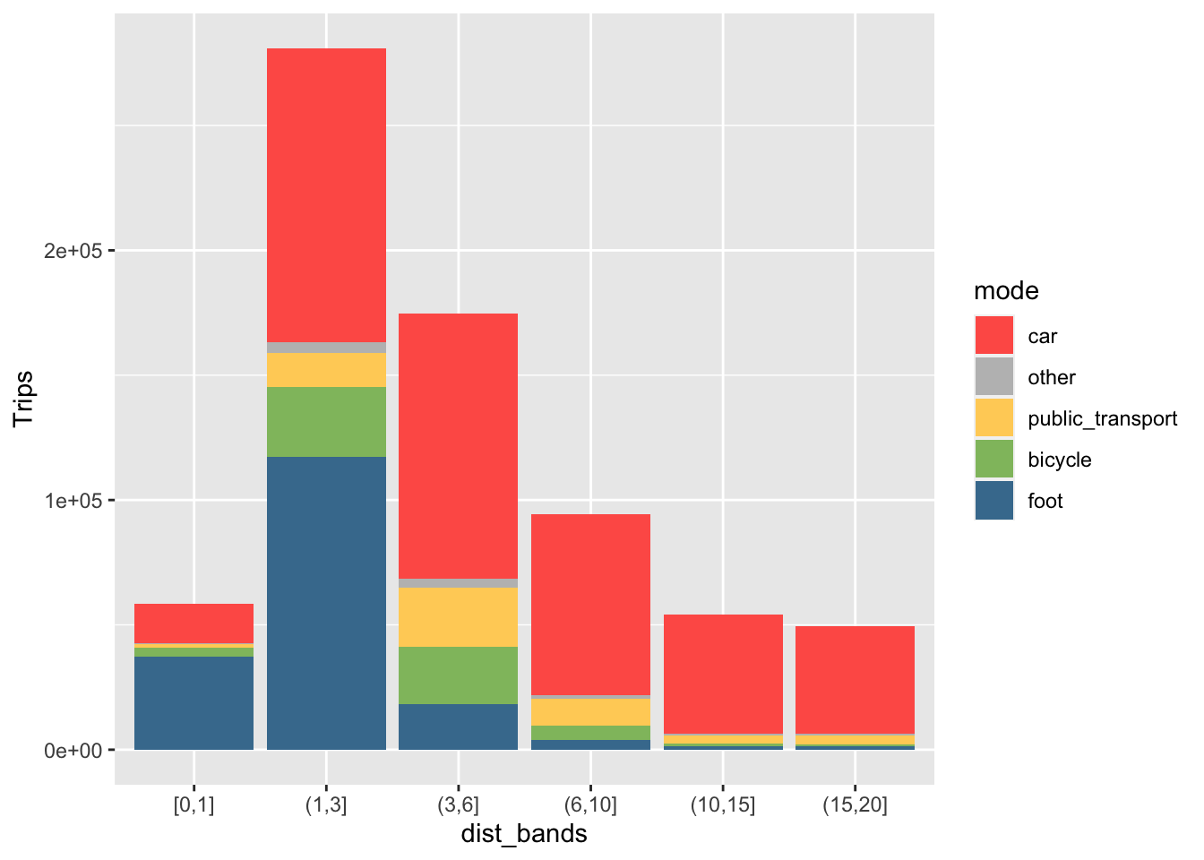
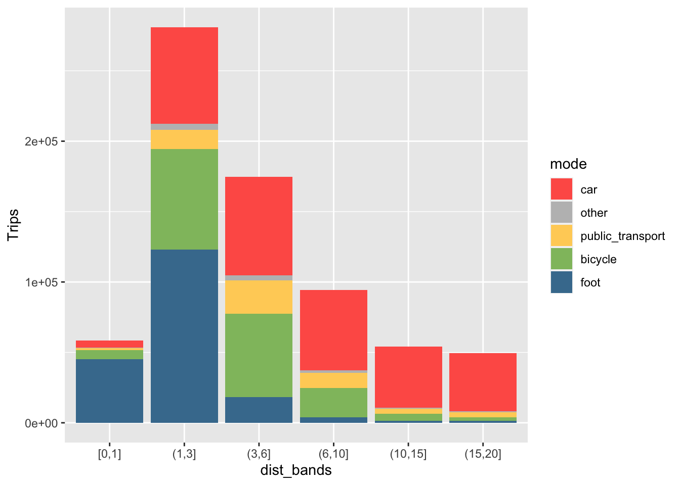
Figure 2.2: Relationship between distance (x axis) and mode share (y axis) in towns and cities in North Yorkshire. (a) left: existing mode shares; (b) right: mode shares under high active travel uptake scenario.
The scenario outlined above may sound ambitious, but it only just meets the government’s aim for walking and cycling to account for 50% of trips in Town and Cities, at least when looking exclusively at single stage commutes in a single region. Furthermore, while the scenario represents a ~200% (3 fold) increase in the total distance travelled by active modes, it only results in a 17% reduction in car km driven in towns. The overall impact on energy use, resource consumption and emissions is much lower for the region overall, including rural areas.
In the context of the government’s aim of fully decarbonising the economy by 2050, the analysis above suggests that more stringent measures focussing on long distance trips, which account for the majority of emissions, may be needed. However, it is still useful to see where there is greatest potential for car trips to be replaced by walking and cycling, as shown in Figure 2.3.
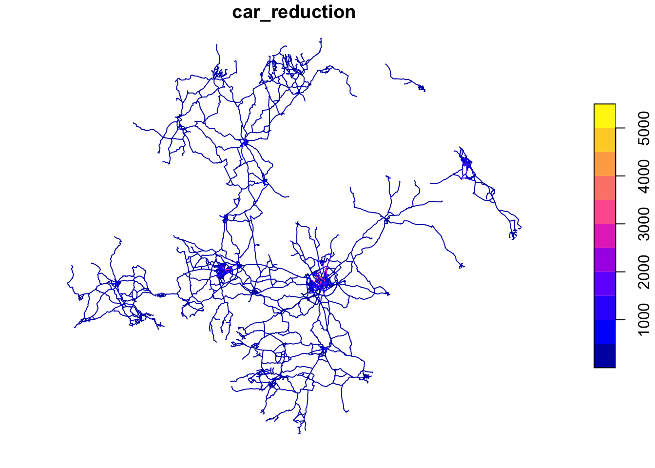
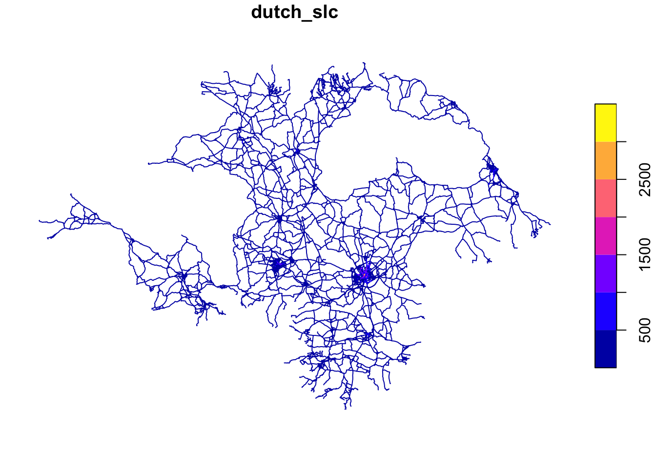
Figure 2.3: Illustration of route network based on car trips that could be replaced by bicycle trips, based on Census data on car trips to work and the Go Dutch uptake function used in the PCT.
2.4 Training uptake models against new datasets
In this section we will create a new scenario called Go York, representing what would happen if people were as likely to cycle as people in York are, for a given trip distance and hilliness. The first step is to subset zones and OD pairs originating in York.5
zones_york = zones_all_joined %>%
  filter(lad_name == "York") %>%
  mutate(pcycle = bicycle / all)
routes_york = routes_all %>%
  filter(lad_name1 == "York") %>%
  mutate(pcycle = bicycle / all)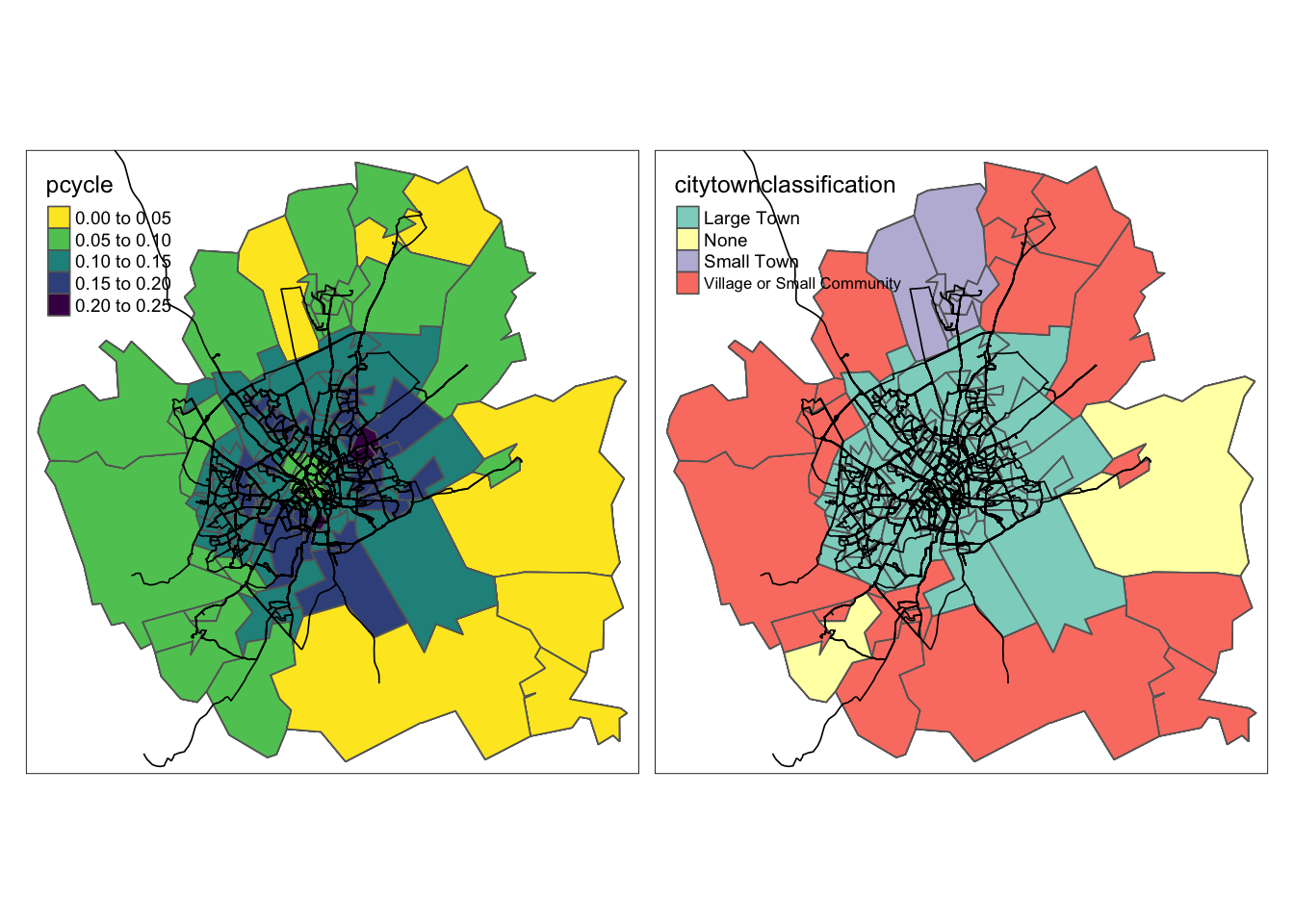
Figure 2.4: Zones in York with colours representing cycling mode share (left) and urban functional classification (right)
We can train an uptake model based on this subset of the routes as follows:
pcycle_model_york = model_pcycle_pct_2020(
  pcycle = routes_york$pcycle,
  distance = routes_york$rq_dist_km,
  gradient = routes_york$rf_avslope_perc,
  weights = routes_york$all
)
summary(pcycle_model_york)
##
## Call:
## stats::glm(formula = pcycle ~ distance + sqrt(distance) + I(distance^2) +
## gradient + distance * gradient + sqrt(distance) * gradient,
## family = "quasibinomial", weights = weights)
##
## Deviance Residuals:
## Min 1Q Median 3Q Max
## -5.5128 -1.0194 -0.3506 0.6731 6.2125
##
## Coefficients:
## Estimate Std. Error t value Pr(>|t|)
## (Intercept) -3.342265 0.243422 -13.730 < 2e-16 ***
## distance -1.052107 0.083389 -12.617 < 2e-16 ***
## sqrt(distance) 2.797373 0.284059 9.848 < 2e-16 ***
## I(distance^2) 0.018713 0.001516 12.347 < 2e-16 ***
## gradient -1.356153 0.222618 -6.092 1.24e-09 ***
## distance:gradient -0.136630 0.060429 -2.261 0.0238 *
## sqrt(distance):gradient 1.100716 0.236224 4.660 3.29e-06 ***
## ---
## Signif. codes: 0 '***' 0.001 '**' 0.01 '*' 0.05 '.' 0.1 ' ' 1
##
## (Dispersion parameter for quasibinomial family taken to be 1.477246)
##
## Null deviance: 6635.3 on 3388 degrees of freedom
## Residual deviance: 4938.1 on 3382 degrees of freedom
## AIC: NA
##
## Number of Fisher Scoring iterations: 5We can then use this model to project cycling levels across the whole region.
routes_all_renamed = routes_all %>%
rename(distance = rf_dist_km, gradient = rf_avslope_perc)
pcycle_go_york_model = boot::inv.logit(predict(pcycle_model_york, newdata = routes_all_renamed))
routes_all$york_slc = routes_all$all * pcycle_go_york_model
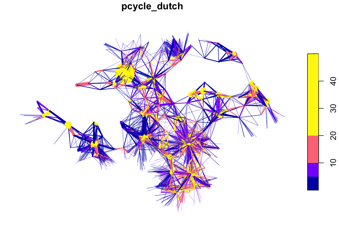
sum(routes_all$bicycle) / sum(routes_all$all)## [1] 0.07062867## [1] 0.1145299## [1] 0.2828958## [1] 0.1721783 Joining commute and school data
PCT is not limited to commuter data only, PCT also provides a range of school data for each region in England and Wales to be downloaded with relative ease.
In the example below, we add a purpose to the get_pct_rnet() function of school.
This allows us to get estimates of cycling potential on the road network for school trips, commuter trips, and school and commuter trips combined.
Note in the figure below that the combined route network provides a more comprehensive (yet still incomplete) overview of cycling potential in the study region.
# get pct rnet data for schools
rnet_school = get_pct_rnet(region = region_name, purpose = "school")
rnet_school = subset(rnet_school, select = -c(`cambridge_slc`)) # subset columns for bind
rnet_all = subset(rnet_all, select = -c(`ebike_slc`,`gendereq_slc`,`govnearmkt_slc`)) # subset columns for bind

rnet_school_commute = rbind(rnet_all,rnet_school) # bind commute and schools rnet data
rnet_school_commute$duplicated_geometries = duplicated(rnet_school_commute$geometry) # find duplicated geometries
rnet_school_commute$geometry_txt = sf::st_as_text(rnet_school_commute$geometry)

rnet_combined = rnet_school_commute %>%
  group_by(geometry_txt) %>% # group by geometry
  summarise(across(bicycle:dutch_slc, sum, na.rm = TRUE)) # and summaries route network which is not a duplicate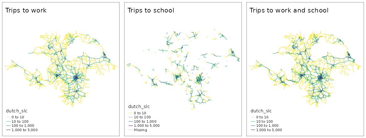
Figure 3.1: Comparison of commute, school, and combined commute and school route networkworks, under the Go Dutch scenario.
References
Barrington-Leigh, Christopher, and Adam Millard-Ball. 2017. “The World’s User-Generated Road Map Is More Than 80% Complete.” PLOS ONE 12 (8): e0180698. https://doi.org/10.1371/journal.pone.0180698.
Goodman, Anna, Ilan Fridman Rojas, James Woodcock, Rachel Aldred, Nikolai Berkoff, Malcolm Morgan, Ali Abbas, and Robin Lovelace. 2019. “Scenarios of Cycling to School in England, and Associated Health and Carbon Impacts: Application of the ‘Propensity to Cycle Tool’.” Journal of Transport & Health 12 (March): 263–78. https://doi.org/10.1016/j.jth.2019.01.008.
Lovelace, Robin, Anna Goodman, Rachel Aldred, Nikolai Berkoff, Ali Abbas, and James Woodcock. 2017. “The Propensity to Cycle Tool: An Open Source Online System for Sustainable Transport Planning.” Journal of Transport and Land Use 10 (1). https://doi.org/10.5198/jtlu.2016.862.
This tutorial was tested on QGIS version 3.20 but it should work fine on other versions, including the Long Term Support version (3.16 at the time of writing in summer 2021). To install the latest version of QGIS see qgis.org. If you are new to QGIS, it is worth taking a look at the User Guide at docs.qgis.org and, for a transport-oriented introduction, the QGIS for Transport Research resource developed by the University of Leeds.↩︎
A great thing about QGIS projects is that, like RStudio projects, they make organising and sharing your work easier. You should be able to see exactly the same project state as that shown in the figure by downloading the zip file at
https://github.com/ITSLeeds/pct/releases/download/0.8.0/pctqgis.zipand opening the pctqgis1.qgz file in QGIS.↩︎This is because QGIS, unlike R’s spatial packages, shows geographic (longitude/latitude) coordinates as if they were projected, which makes maps seem squashed at high latitudes far from the equator.↩︎
Hint: installing the QuickOSM and QuickMapServices plugins may help. You will need to transform the bridge before finding a buffer around it. You will need to use the Select by Location Vector Research tool.↩︎
Technically, the analysis does not show where OD pairs originate because the PCT OD data aggregates trips going in both directions into a single desire line. Instead we will use just
geo_code1as a proxy for trip origin. For real world applications, you should start with the original OD data.↩︎