if (!require("pak")) install.packages("pak")
pak::pkg_install(c("sf", "tidyverse", "remotes", "ggspatial"))
# GitHub pkgs
pak::pkg_install("Nowosad/spDataLarge")Geographic and origin-destination data
1 Introduction
In this practical session, we will learn how to use geogarphic and origin-destination data. The contents of the session are as follows:
- We will start with reviewing the homework from the previous session
- A short lecture on geographic and origin-destination data (see slides)
- Practical session working with various data, including analysing origin-destination trip flows in London Cycle Hire System.
- Bonus: Geometry operations and spatial analysis
- Homework and next session
2 Review Homework
Your homework last week was to import and visualise some transport datasets. In groups of 2 or 3 (a demonstrator will help out with each group):
- Choose a volunteer from each group to share their code with colleagues (via email or GitHub): can others reproduce the results?
- Discuss the code and suggest improvements
3 Getting started with GIS in R
Note that this practical takes sections from Chapters 2 - 8 of Geocomputation with R. You should expand your knowledge by reading these chapters in full.
Pre-requisites
You need to have a number of packages installed and loaded. Install the packages by typing in the following commands into RStudio (you do not need to add the comments after the # symbol)
If you need to install any of these packages use:
library(sf)        # vector data package
library(tidyverse) # tidyverse packages
library(ggspatial) # ggspatial package
library(spData)    # spatial data package
# Install necessary packages (uncomment if not already installed)
# !pip install geopandas pandas matplotlib seaborn
import geopandas as gpd # vector data package
import pandas as pd # data manipulation
import matplotlib.pyplot as plt # plotting
import seaborn as sns # advanced plotting
# For spatial data, geopandas comes with sample datasets
# Alternatively, we can use the naturalearth datasets
import geopandas.datasets- Check your packages are up-to-date with
update.packages()in R (or equivalent in Python) - Create a project folder with an appropriate name for this session (e.g.
practical3) - Create appropriate folders for code, data and anything else (e.g. images)
- Create a script called
learning-OD.R, e.g. with the following command:
mkdir code
code code/learning-OD.R # for R
code code/learning-OD.py # for Python
3.1 Basic sf operations
We will start with a simple map of the world. Load the world object from the spData package. Notice the use of :: to say that you want the world object from the spData package.
world = spData::worldworld = gpd.read_file(
'https://naturalearth.s3.amazonaws.com/110m_cultural/ne_110m_admin_0_countries.zip'
)Use some basic R functions to explore the world object. e.g. class(world), dim(world), head(world), summary(world). Also view the world object by clicking on it in the Environment panel.
sf objects can be plotted with plot().
plot(world)
print(type(world))       # Equivalent to class(world)
print(world.shape)       # Equivalent to dim(world)
print(world.head())      # Equivalent to head(world)
print(world.describe())  # Equivalent to summary(world)

# Plotting the world GeoDataFrame
world.plot(figsize=(12, 8))
plt.title('World Map')
plt.show()
Note that this makes a map of each column in the data frame. Try some other plotting options
plot(world[3:6])
plot(world["pop"])
# Since world is a GeoDataFrame, we can select columns by position
# However, GeoPandas plots the geometry, so we need to specify columns
fig, axes = plt.subplots(1, 3, figsize=(15, 5))
world.plot(column='POP_EST', ax=axes[0])
world.plot(column='GDP_YEAR', ax=axes[1])
world.plot(column='CONTINENT', ax=axes[2])
plt.show()
3.2 Basic spatial operations
Load the nz and nz_height datasets from the spData package.
nz = spData::nz
nz_height = spData::nz_height
nz = gpd.read_file("https://github.com/Nowosad/spData_files/raw/refs/heads/main/data/nz.gpkg")
nz_height = gpd.read_file("https://github.com/Nowosad/spData_files/raw/refs/heads/main/data/nz_height.gpkg")We can use tidyverse functions like filter and select on sf objects in the same way you did in Practical 1.
canterbury = nz |> filter(Name == "Canterbury")
canterbury_height = nz_height[canterbury, ]
canterbury = nz[nz['Name'] == 'Canterbury']In this case we filtered the nz object to only include places called Canterbury and then did and intersection to find objects in the nz_height object that are in Canterbury.
This syntax is not very clear. But is the equivalent to
canterbury_height = nz_height[canterbury, , op = st_intersects]canterbury_height = gpd.overlay(nz_height, canterbury, how='intersection')There are many different types of relationships you can use with op. Try ?st_intersects() to see more. For example this would give all the places not in Canterbury
nz_height[canterbury, , op = st_disjoint]canterbury_height = gpd.sjoin(nz_height, canterbury, op='intersects')
4 Getting started with OD data
In this section we will look at basic transport data in the R package stplanr.
Load the stplanr package as follows:
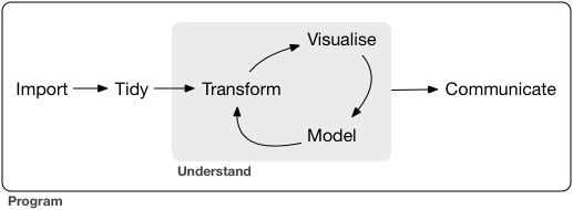
library(stplanr)The stplanr package contains some data that we can use to demonstrate principles in Data Science, illustrated in the Figure below. Source: Chapter 1 of R for Data Science (Wickham et al., 2023) available online.
First we will load some sample data:
od_data = stplanr::od_data_sample
zone = stplanr::cents_sf
import pandas as pd
od_data = pd.read_csv('https://github.com/ropensci/stplanr/releases/download/v1.2.2/od_data_sample.csv')You can click on the data in the environment panel to view it or use head(od_data) Now we will rename one of the columns from foot to walk
od_data = od_data |>
rename(walk = foot)od_data.rename(columns={'foot': 'walk'}, inplace=True)Next we will made a new dataset od_data_walk by taking od_data and piping it (|>) to filter the data frame to only include rows where walk > 0. Then select a few of the columns and calculate two new columns proportion_walk and proportion_drive.
od_data_walk = od_data |>
  filter(walk > 0) |>
  select(geo_code1, geo_code2, all, car_driver, walk) |>
  mutate(proportion_walk = walk / all, proportion_drive = car_driver / all)
od_data_walk = od_data[od_data['walk'] > 0].copy()
od_data_walk = od_data_walk[['geo_code1', 'geo_code2', 'all', 'car_driver', 'walk']]
od_data_walk['proportion_walk'] = od_data_walk['walk'] / od_data_walk['all']
od_data_walk['proportion_drive'] = od_data_walk['car_driver'] / od_data_walk['all']We can use the generic plot function to view the relationships between variables
plot(od_data_walk)
sns.pairplot(od_data_walk)
plt.show()
R has built in modelling functions such as lm lets make a simple model to predict the proportion of people who walk based on the proportion of people who drive.
model1 = lm(proportion_walk ~ proportion_drive, data = od_data_walk)
od_data_walk$proportion_walk_predicted = model1$fitted.values
# pip install statsmodels
import statsmodels.formula.api as smf
model1 = smf.ols('proportion_walk ~ proportion_drive', data=od_data_walk).fit()
od_data_walk['proportion_walk_predicted'] = model1.fittedvaluesWe can use the ggplot2 package to graph our model predictions.
ggplot(od_data_walk) +
  geom_point(aes(proportion_drive, proportion_walk)) +
  geom_line(aes(proportion_drive, proportion_walk_predicted))
plt.figure(figsize=(8, 6))
plt.scatter(od_data_walk['proportion_drive'], od_data_walk['proportion_walk'], label='Observed')
plt.plot(od_data_walk['proportion_drive'], od_data_walk['proportion_walk_predicted'], color='red', label='Predicted')
plt.xlabel('Proportion Drive')
plt.ylabel('Proportion Walk')
plt.legend()
plt.show()
Exercises
- What is the class of the data in
od_data? - Subset (filter) the data to only include OD pairs in which at least one person (
> 0) person walks (bonus: on what % of the OD pairs does at least 1 person walk?) - Calculate the percentage who cycle in each OD pair in which at least 1 person cycles
- Is there a positive relationship between walking and cycling in the data?
- Bonus: use the function
od2line()in to convert the OD dataset into geographic desire lines
Code for Exercises (click to reveal, but try to do them yourself first)
class(od_data)print("Class of od_data:", type(od_data))od_data_walk = od_data |>
filter(walk > 0)
nrow(od_data_walk) / nrow(od_data) * 100od_data_walk = od_data[od_data['walk'] > 0].copy()
percentage_walk = (len(od_data_walk) / len(od_data)) * 100
print(f"Percentage of OD pairs where at least one person walks: {percentage_walk}%")#|
od_data = od_data |>
filter(bicycle > 0) |>
mutate(perc_cycle = (bicycle / all) * 100)od_data_cycle = od_data[od_data['bicycle'] > 0].copy()
od_data_cycle['perc_cycle'] = (od_data_cycle['bicycle'] / od_data_cycle['all']) * 100od_data_new = od_data |>
filter(walk > 0, bicycle > 0) |>
select(bicycle, walk, all)
model = lm(walk ~ bicycle, weights = all, data = od_data_new)
od_data_new$walk_predicted = model$fitted.values
ggplot(od_data_new) +
geom_point(aes(bicycle, walk, size = all)) +
geom_line(aes(bicycle, walk_predicted))od_data_new = od_data[(od_data['walk'] > 0) & (od_data['bicycle'] > 0)].copy()
od_data_new = od_data_new[['bicycle', 'walk', 'all']]
# Weighted linear regression
import statsmodels.api as sm
weights = od_data_new['all']
X = sm.add_constant(od_data_new['bicycle'])
wls_model = sm.WLS(od_data_new['walk'], X, weights=weights)
results = wls_model.fit()
od_data_new['walk_predicted'] = results.fittedvalues
# Plotting the relationship
plt.figure(figsize=(8, 6))
plt.scatter(od_data_new['bicycle'], od_data_new['walk'], s=od_data_new['all']*0.1, label='Data')
plt.plot(od_data_new['bicycle'], od_data_new['walk_predicted'], color='red', label='Fitted Line')
plt.xlabel('Bicycle')
plt.ylabel('Walk')
plt.legend()
plt.show()desire_lines = stplanr::od2line(flow = od_data, zones = zone)
plot(desire_lines)
# save zone as gpkg
sf::st_write(zone, "zone.geojson")import pandas as pd
import geopandas as gpd
from shapely.geometry import LineString
od_data = pd.read_csv('https://github.com/ropensci/stplanr/releases/download/v1.2.2/od_data_sample.csv')
zones = gpd.read_file('https://github.com/ropensci/stplanr/releases/download/v1.2.2/zones.geojson')
# Ensure the CRS is set (replace 'epsg:4326' with your actual CRS if different)
if zones.crs is None:
zones.set_crs(epsg=4326, inplace=True)
# If zones are polygons, compute centroids
if zones.geom_type.isin(['Polygon', 'MultiPolygon']).any():
print("Creating centroids representing desire line start and end points.")
zones['geometry'] = zones.centroid
# Create a mapping from 'geo_cod' to 'geometry'
geo_cod_to_geometry = dict(zip(zones['geo_cod'], zones['geometry']))
# Map origin and destination geometries
od_data['geometry_o'] = od_data['geo_code1'].map(geo_cod_to_geometry)
od_data['geometry_d'] = od_data['geo_code2'].map(geo_cod_to_geometry)
# Check for any missing matches
missing_origins = od_data[od_data['geometry_o'].isnull()]
missing_destinations = od_data[od_data['geometry_d'].isnull()]
if not missing_origins.empty:
print(f"Missing origin geometries for {len(missing_origins)} records")
if not missing_destinations.empty:
print(f"Missing destination geometries for {len(missing_destinations)} records")
# Remove rows with missing geometries
od_data.dropna(subset=['geometry_o', 'geometry_d'], inplace=True)
# Create LineString geometries for desire lines
od_data['geometry'] = od_data.apply(
lambda row: LineString([row['geometry_o'], row['geometry_d']]), axis=1
)
# Create a GeoDataFrame for the desire lines
desire_lines = gpd.GeoDataFrame(od_data, geometry='geometry', crs=zones.crs)
# Plot the desire lines
desire_lines.plot()5 Processing origin-destination data in Bristol
This section is based on Chapter 12 of Geocomputation with R. You should read this chapter in full in your own time.
We need the stplanr package which provides many useful functions for transport analysis and tmap package which enables advanced mapping features.
library(stplanr)
library(tmap)
We will start by loading two datasets:
od = spDataLarge::bristol_od
zones = spDataLarge::bristol_zones
od_data = gpd.read_file('https://github.com/ropensci/stplanr/releases/download/v1.2.2/bristol_od.geojson')
zones = gpd.read_file('https://github.com/ropensci/stplanr/releases/download/v1.2.2/bristol_zones.geojson')
if zones.crs is None:
zones.set_crs(epsg=4326, inplace=True)
# If zones are polygons, compute centroids
if zones.geom_type.isin(['Polygon', 'MultiPolygon']).any():
print("Creating centroids representing desire line start and end points.")
zones['geometry'] = zones.centroid
# Create a mapping from 'geo_cod' to 'geometry'
geo_cod_to_geometry = dict(zip(zones['geo_code'], zones['geometry']))
# Map origin and destination geometries
od_data['geometry_o'] = od_data['geo_code1'].map(geo_cod_to_geometry)
od_data['geometry_d'] = od_data['geo_code2'].map(geo_cod_to_geometry)
# Check for any missing matches
missing_origins = od_data[od_data['geometry_o'].isnull()]
missing_destinations = od_data[od_data['geometry_d'].isnull()]
if not missing_origins.empty:
print(f"Missing origin geometries for {len(missing_origins)} records")
if not missing_destinations.empty:
print(f"Missing destination geometries for {len(missing_destinations)} records")
# Remove rows with missing geometries
od_data.dropna(subset=['geometry_o', 'geometry_d'], inplace=True)
# Create LineString geometries for desire lines
od_data['geometry'] = od_data.apply(
lambda row: LineString([row['geometry_o'], row['geometry_d']]), axis=1
)
# Create a GeoDataFrame for the desire lines
desire_lines = gpd.GeoDataFrame(od_data, geometry='geometry', crs=zones.crs)
# Plot the desire lines
desire_lines.plot()Explore these datasets using the functions you have already learnt (e.g. head,nrow).
You will notice that the od datasets has shared id values with the zones dataset. We can use these to make desire lines between each zone. But first we must filter out trips that start and end in the same zone.
od_inter = filter(od, o != d)
desire_lines = od2line(od_inter, zones)
# Filter OD data where origin and destination are different
od_inter = od[od['o'] != od['d']].copy()
od_inter = od_inter.merge(zones[['geo_code', 'geometry']], left_on='o', right_on='geo_code', how='left')
od_inter.rename(columns={'geometry': 'origin_geometry'}, inplace=True)
od_inter = od_inter.merge(zones[['geo_code', 'geometry']], left_on='d', right_on='geo_code', how='left')
od_inter.rename(columns={'geometry': 'destination_geometry'}, inplace=True)Let’s calculate the percentage of trips that are made by active travel
desire_lines$Active = (desire_lines$bicycle + desire_lines$foot) /
desire_lines$all * 100desire_lines['Active'] = (desire_lines['bicycle'] + desire_lines['foot']) / desire_lines['all'] * 100Now use tmap to make a plot showing the number of trips and the percentage of people using active travel. Alternatively, you may use the ggplot2 for visualisation.
desire_lines = desire_lines[order(desire_lines$Active), ]

tm_shape(desire_lines) + # Define the data frame used to make the map
  tm_lines(
    col = "Active", # We want to map lines, the colour (col) is based on the "Active" column
    palette = "plasma", # Select a colour palette
    alpha = 0.7, # Make lines slightly transparent
    lwd = "all"
  ) + # The line width (lwd) is based on the "all" column
  tm_layout(legend.outside = TRUE) + # Move the ledgend outside the map
  tm_scalebar() # Add a scale bar to the map
desire_lines = desire_lines[order(desire_lines$Active), ]

ggplot() +
  geom_sf(
    data = desire_lines, # Define the data frame used to make the map
    aes(
      colour = Active, # We want to map lines, the colour  is based on the "Active" column
      alpha = all, # Make lines slightly transparent and based on the "all" column
      linewidth = all # The line width is based on the "all" column
    )
  ) +
  scale_colour_viridis_c(option = "C") + # Select a colour palette
  scale_linewidth_binned(range = c(0.03, 0.6), guide = "legend") + # Set max and min ranges for line width
  scale_alpha(range = c(0.1, 1), guide = "legend") + # Set max and min ranges for transparency
  annotation_scale(location = "br", width_hint = 0.3) + # Scale bar (bottom left)
  annotation_north_arrow(
    location = "tl", which_north = "true",
    style = north_arrow_fancy_orienteering()
  ) + # North arrow (top left)
  theme_void()
desire_lines = desire_lines.sort_values('Active')

# Normalize line widths for plotting
max_trips = desire_lines['all'].max()
desire_lines['linewidth'] = (desire_lines['all'] / max_trips) * 5

# Plotting desire lines with active travel percentage
fig, ax = plt.subplots(figsize=(12, 10))
desire_lines.plot(
    ax=ax,
    column='Active',
    cmap='plasma',
    linewidth=desire_lines['linewidth'],
    alpha=0.7,
    legend=True
)
plt.title('Desire Lines with Active Travel Percentage')

# Add basemap (optional)
# ctx.add_basemap(ax, crs=desire_lines.crs.to_string())

plt.show()
Now that we have geometry attached to our data we can calculate other variables of interest. For example let’s calculate the distacne travelled and see if it relates to the percentage of people who use active travel.
desire_lines$distance_direct_m = as.numeric(st_length(desire_lines))desire_lines['distance_direct_m'] = desire_lines.geometry.lengthNote the use of as.numeric by default st_length and many other functions return a special type of result with unit. Here we force the results back into the basic R numerical value. But be careful! The units you get back depend on the coordinate reference system, so check your data before you assume what values mean.
ggplot(desire_lines) +
  geom_point(aes(x = distance_direct_m, y = Active, size = all)) +
  geom_smooth(aes(x = distance_direct_m, y = Active))
plt.figure(figsize=(8, 6))
sns.scatterplot(data=desire_lines, x='distance_direct_m', y='Active', size='all', legend=False)
sns.regplot(data=desire_lines, x='distance_direct_m', y='Active', scatter=False, color='red')
plt.xlabel('Distance (meters)')
plt.ylabel('Active Travel Percentage')
plt.title('Active Travel vs Distance')
plt.show()
The blue line is a smoothed average of the data. It shows a common concept in transport research, the distance decay curve. In this case it shows that the longer the journey the less likely people are to use active travel. But this concept applies to all kinds of travel decisions. For example you are more likely to travel to a nearby coffee shop than a far away coffee shop. Different types of trip have different curves, but most people always have a bias for shorter trips.
6 Processing origin-destination data in London Cycle Hire System
In this section, we will be working with origin-destination data in London Cycle Hire System (LCHS). We will specifically examine how a London Tube(Underground) strike influenced cyclists’ origin-destination choices. Public transport disruptions are becoming increasingly common, triggered by various factors including:
- Infrastructure maintenance requirements
- Natural disasters
- Large-scale events (festivals, strikes, etc.)
By analyzing how people adapt their travel patterns during such events, we can better inform urban transport planning and decision-making strategies.
For this section, we’ll be using cleaned cycling data originally sourced from TfL’s open data portal (cycling.data.tfl.gov.uk).
Let’s begin by loading the following two datasets
# load the station location dataset
u_stations = "https://github.com/itsleeds/tds/releases/download/2025/p3-london-bike_docking_stations.geojson"
if (!file.exists("p3-london-bike_docking_stations.geojson")) download.file(u_stations, "p3-london-bike_docking_stations.geojson")
bike_docking_stations = read_sf("p3-london-bike_docking_stations.geojson")

# load the bike trip origin and destination dataset
u_trips = "https://github.com/itsleeds/tds/releases/download/2025/p3-london-bike_trips.csv"
if (!file.exists("p3-london-bike_trips.csv")) download.file(u_trips, "p3-london-bike_trips.csv")
bike_trips = read_csv("p3-london-bike_trips.csv")
Explore these datasets using the functions you have learnt (e.g. head, nrow)
head(bike_docking_stations)Simple feature collection with 6 features and 2 fields
Geometry type: POINT
Dimension: XY
Bounding box: xmin: -0.197574 ymin: 51.49313 xmax: -0.084606 ymax: 51.53006
Geodetic CRS: WGS 84
# A tibble: 6 × 3
station_id station_name geometry
<dbl> <chr> <POINT [°]>
1 1 River Street , Clerkenwell (-0.109971 51.52916)
2 2 Phillimore Gardens, Kensington (-0.197574 51.49961)
3 3 Christopher Street, Liverpool Street (-0.084606 51.52128)
4 4 St. Chad's Street, King's Cross (-0.120974 51.53006)
5 5 Sedding Street, Sloane Square (-0.156876 51.49313)
6 6 Broadcasting House, Marylebone (-0.144229 51.51812)nrow(bike_docking_stations)[1] 820head(bike_trips)# A tibble: 6 × 4
start_time stop_time start_station_id end_station_id
<dttm> <dttm> <dbl> <dbl>
1 2015-07-02 00:00:00 2015-07-02 00:21:00 64 490
2 2015-07-02 00:00:00 2015-07-02 00:11:00 72 439
3 2015-07-02 00:00:00 2015-07-02 00:10:00 87 717
4 2015-07-02 00:00:00 2015-07-02 00:15:00 406 395
5 2015-07-02 00:00:00 2015-07-02 00:24:00 333 103
6 2015-07-02 00:00:00 2015-07-02 00:11:00 666 635nrow(bike_trips)[1] 144048Let’s examine our bike_trips data, which covers three specific Thursdays: July 2nd, July 9th, and July 16th, 2015. July 9th marks the London Underground strike, while the other two dates serve as comparison points one week before and after the strike.
During the Tube Strike, some people adopted bikeshare to replace the Tube travel, hence we should be able to observe some different in trip account.
bike_trips = bike_trips |>
  mutate(date = date(start_time)) |>
  mutate(type_day = case_when(
    date == as.Date("2015-07-09") ~ "Strike Day",
    TRUE ~ "Non-Strike Day"
  ))
bike_trips |>
  group_by(date, type_day) |>
  summarise(count = n()) |>
  ggplot() +
  geom_bar(aes(
    x = as.factor(date),
    y = count,
    fill = type_day
  ), stat = "identity") +
  xlab("Date") +
  ylab("Count of bike trips") +
  labs(fill = "Type of day")
The increase in trips is likely unevenly distributed by time, so it would be useful to examine the changes and differences by hour. This will help us identify when the most significant changes occur.
bike_trips |>
  mutate(
    hour = hour(start_time),
    date = as.factor(date)
  ) |>
  group_by(date, hour) |>
  summarise(count = n()) |>
  ggplot() +
  geom_line(aes(x = hour, y = count, color = date, group = date), size = 1, alpha = .6) +
  geom_point(aes(x = hour, y = count, color = date), size = 2) +
  scale_x_continuous(breaks = seq(0, 23, by = 4))
Whist above temporal analysis provide useful summaries, visual analysis of the origin-destination changes allow us to characterise with greater richness the nature of changes in response to the strike events. Let’ try to calculate the changes in o-d and map them!
To break the task down, we will 1. Calculate the frequeny of each origin-destination pair on the strike day 2. Calculate the average frequancy of each origin-destination pair on the non-strike day 3. find out the difference
# 1. Calculate the frequeny of each origin-destination pair on the strike day
od_strike = bike_trips |>
  filter(type_day == "Strike Day") |>
  group_by(start_station_id, end_station_id) |>
  summarise(count_strike = n())

# 2. Calculate the average frequancy of each origin-destination pair on the non-strike day
od_non_strike = bike_trips |>
  filter(type_day == "Non-Strike Day") |>
  group_by(start_station_id, end_station_id) |>
  summarise(count_non_strike = n() / 2) # we have two non-strike days, hence /2 can help get the mean value
To obtain the changes, we will need to join the origin-destination pairs in the two dataframe we just created.
The dplyr package provides a family of intuitive join functions:
| Join Type | Function | Description |
|---|---|---|
| Inner Join | inner_join(df1, df2, by = "key") |
Keeps only matching rows in both datasets. |
| Left Join | left_join(df1, df2, by = "key") |
Keeps all rows from df1, adds matching rows from df2. |
| Right Join | right_join(df1, df2, by = "key") |
Keeps all rows from df2, adds matching rows from df1. |
| Full Join | full_join(df1, df2, by = "key") |
Keeps all rows from both datasets. |
| Semi Join | semi_join(df1, df2, by = "key") |
Keeps rows from df1 that have matches in df2. |
| Anti Join | anti_join(df1, df2, by = "key") |
Keeps rows from df1 that do not have matches in df2. |
# join the two dataframes
od_change = full_join(od_strike, od_non_strike, by = c("start_station_id", "end_station_id")) |>
  replace_na(list(count_strike = 0, count_non_strike = 0))

# create(mutate) a new column of changes in od count
od_change = filter(od_change, start_station_id != end_station_id) |>
  mutate(count_change = count_strike - count_non_strike) |>
  arrange(desc(count_change))
Let have a look at the joined result:
head(od_change)# A tibble: 6 × 5
# Groups: start_station_id [6]
start_station_id end_station_id count_strike count_non_strike count_change
<dbl> <dbl> <int> <dbl> <dbl>
1 14 109 29 5.5 23.5
2 406 303 36 17 19
3 55 109 18 1.5 16.5
4 307 191 35 18.5 16.5
5 427 109 14 0.5 13.5
6 197 194 15 2 13 We have succesfully joined the data, and the output od_change has both the trip count on strike day (count_strike) and non-strike day (count_non_strike), in addition, a new variable of count_change is created. Next, let clean the output further and create the od lines
# focusing on not self-loop trips
od_inter_change = filter(od_change, start_station_id != end_station_id) |> arrange(desc(count_change))

# create the od lines
change_desire_lines = od2line(od_change, bike_docking_stations)
We are particularly interested in identifying origin-destination pairs where the number of trips has increased. To focus on these, we use the filter function to select desire lines with at least one additional trip on the strike day. You can adjust the threshold (currently set to 1) as needed.
ggplot() +
  geom_sf(
    data = change_desire_lines |> filter(count_change >= 1) |> arrange(count_change), # Define the data frame used to make the map
    aes(
      colour = count_change, # We want to map lines, the colour  is based on the "count_change" column
      alpha = count_change, # Make lines slightly transparent and based on the "count_change" column
      linewidth = count_change # The line width is based on the "count_change" column
    )
  ) +
  scale_colour_viridis_c(option = "C") + # Select a colour palette
  scale_linewidth_binned(range = c(0.01, 1.6), guide = "legend") + # Set max and min ranges for line width
  scale_alpha(range = c(0.001, 0.7), guide = "legend") + # Set max and min ranges for transparency
  annotation_scale(location = "br", width_hint = 0.3) + # Map scale bar (bottom right)
  annotation_north_arrow(
    location = "tl", which_north = "true",
    style = north_arrow_fancy_orienteering()
  ) + # North arrow (top left)
  theme_void()
To enhance the map, adding some background context could be useful. Let’s try incorporating the River Thames and green spaces (parks) in central London.
Let’s check how the background looks. You can also customize the colors of the rivers and parks by modifying the values assigned to fill and color.
# load the river and parks
u_rivers = "https://github.com/itsleeds/tds/releases/download/2025/p3-london-rivers.geojson"
if (!file.exists("p3-london-rivers.geojson")) download.file(u_rivers, "p3-london-rivers.geojson")
rivers = st_read("p3-london-rivers.geojson")
Reading layer `rivers' from data source
`/home/runner/work/tds/tds/p3/p3-london-rivers.geojson' using driver `GeoJSON'
Simple feature collection with 3 features and 0 fields
Geometry type: GEOMETRYCOLLECTION
Dimension: XY
Bounding box: xmin: -0.2391075 ymin: 51.4639 xmax: 0.0002165973 ymax: 51.50991
Geodetic CRS: WGS 84u_parks = "https://github.com/itsleeds/tds/releases/download/2025/p3-london-parks.geojson"
if (!file.exists("p3-london-parks.geojson")) download.file(u_parks, "p3-london-parks.geojson")
parks = st_read("p3-london-parks.geojson")Reading layer `parks' from data source
`/home/runner/work/tds/tds/p3/p3-london-parks.geojson' using driver `GeoJSON'
Simple feature collection with 288 features and 10 fields
Geometry type: MULTIPOLYGON
Dimension: XY
Bounding box: xmin: -0.2391075 ymin: 51.44964 xmax: 0.0002165973 ymax: 51.55098
Geodetic CRS: WGS 84ggplot() +
geom_sf(data = parks, fill = "#d9f5e0", color = "#d9f5e0") + # add parks in central London to the map
geom_sf(data = rivers, color = "#08D9D6", linewidth = 3) + # add river Thames in central London to the map
theme_void()
Now, let’s bring the origin-destination desire lines and the base map together! Can you identify key locations where bike trip origin-destination changes are most significant?
# Define the data frame used to visualise the od
change_to_plot = change_desire_lines |>
  filter(count_change >= 1) |>
  arrange(count_change)

ggplot() +
  # add parks in central London to the map:
  geom_sf(data = parks, fill = "#d9f5e0", color = "#d9f5e0") +
  # add river Thames in central London to the map:
  geom_sf(data = rivers, color = "#08D9D6", linewidth = 3) +
  geom_sf(
    data = change_to_plot,
    aes(
      colour = count_change, # We want to map lines, the colour is based on the "count_change" column
      alpha = count_change, # Make lines slightly transparent and based on the "count_change" column
      linewidth = count_change # The line width is based on the "count_change" column
    )
  ) +
  scale_colour_viridis_c(option = "C") + # Select a colour palette
  scale_linewidth_binned(range = c(0.01, 1.6), guide = "legend") + # Set max and min ranges for line width
  scale_alpha(range = c(0.001, 0.7), guide = "legend") + # Set max and min ranges for transparency
  annotation_scale(location = "br", width_hint = 0.3) + # Scale bar (bottom left)y
  annotation_north_arrow(
    location = "tl", which_north = "true",
    style = north_arrow_fancy_orienteering()
  ) + # North arrow (top left)
  theme_void()
7 Bonus
During the Tube strike, bike docking stations closer to Tube stations are likely to experience higher travel activity than those farther away.
To quickly assess whether there is a difference, we can create a buffer around Tube stations and calculate the number of trips originating from bike docking stations within the buffer zone. We can then compare these figures to those from docking stations outside the buffer zone.
First, let create the buffer zones for tube stations in central london
# import the tube station data
u_tube = "https://github.com/itsleeds/tds/releases/download/2025/p3-london-tube_stations.geojson"
if (!file.exists("p3-london-tube_stations.geojson")) download.file(u_tube, "p3-london-tube_stations.geojson")
tube_stations = read_sf("p3-london-tube_stations.geojson")

# use the bounding box of the bike docking stations to crop the tube stations
# this can help us focus on central London - which is covered by the LCHS
tube_stations_central_london = st_crop(tube_stations, st_bbox(bike_docking_stations))

# create the buffer zones, we set the buffer radius to 250m
# you may adjust the value if you would like to create smaller or larger buffer zones.
tube_stations_central_london_buffer = st_buffer(tube_stations_central_london %>% st_transform(27700), dist = 250)

# visualise the buffers, tube stations and bike docking stations
ggplot()+
  geom_sf(data = tube_stations_central_london_buffer, fill ="#3ba2c7", color = NA, alpha =0.3)+
  geom_sf(data = tube_stations_central_london, color = "#3ba2c7")+
  geom_sf(data = bike_docking_stations, color = "#d45b70", size = 0.5)
You may have noticed that we created a buffer for each Tube station. We can merge all the buffers geometry into a single geometry.
st_union() is a function in the sf package in R, used to merge or dissolve geometries into a single geometry. It is commonly used in spatial data processing when you need to combine multiple polygons, lines, or points into one.
tube_stations_central_london_buffer_merged = st_union(tube_stations_central_london_buffer)

ggplot()+
  geom_sf(data = tube_stations_central_london_buffer_merged, fill ="#3ba2c7", color = NA, alpha =0.3)+
  geom_sf(data = tube_stations_central_london, color = "#3ba2c7")+
  geom_sf(data = bike_docking_stations, color = "#d45b70", size = 0.5)
Since we have obtained the merged buffer, let’s find out which bike docking stations fall inside the buffer. To achieve this, we can use the st_within() function. st_within() checks if one geometry is completely inside another geometry.
We also need to create a new column for the bike_docking_stations to store the result from st_within()
bike_docking_stations = bike_docking_stations |>
  mutate(inside_tube_buffer = st_within(bike_docking_stations,tube_stations_central_london_buffer_merged %>% st_transform(4326), sparse = FALSE))
head(bike_docking_stations)
Simple feature collection with 6 features and 3 fields
Geometry type: POINT
Dimension: XY
Bounding box: xmin: -0.197574 ymin: 51.49313 xmax: -0.084606 ymax: 51.53006
Geodetic CRS: WGS 84
# A tibble: 6 × 4
station_id station_name geometry inside_tube_buffer[,1]
<dbl> <chr> <POINT [°]> <lgl>
1 1 River Street , Cl… (-0.109971 51.52916) FALSE
2 2 Phillimore Garden… (-0.197574 51.49961) FALSE
3 3 Christopher Stree… (-0.084606 51.52128) FALSE
4 4 St. Chad's Street… (-0.120974 51.53006) TRUE
5 5 Sedding Street, S… (-0.156876 51.49313) TRUE
6 6 Broadcasting Hous… (-0.144229 51.51812) FALSE As you can see, the bike_docking_stations now has a column named inside_tube_buffer, which contains binary outcome.
Let’s plot them and use inside_tube_buffer for the colour of the bike docking staions.
ggplot()+
  geom_sf(data = tube_stations_central_london_buffer_merged, fill ="#3ba2c7", color = NA, alpha =0.3)+
  geom_sf(data = bike_docking_stations,
  # use "inside_tube_buffer" for the colour of the bike docking staions
          aes(color = inside_tube_buffer),
          size = 1)
Finally, let’s compare the average number of trips (by trip origin) between the two types of bike docking stations: those inside the buffer and those outside the buffer.
What pattern did you observe?
bike_trips |>
  group_by(start_station_id, date, type_day) |>
  summarise(count = n(), .groups = "drop") |>

  # Join with docking station data to get station attributes (excluding geometry)
  left_join(
    bike_docking_stations |> st_drop_geometry(),
    by = c("start_station_id" = "station_id")
  ) |>

  # Group by whether the station is inside the Tube buffer and by type_day (strike day or non-strike day)
  group_by(inside_tube_buffer, type_day) |>
  summarise(mean_count = mean(count), .groups = "drop") |>

  # Plot the average trip count by type_day, bar fill colour by buffer status
  ggplot(aes(x = type_day, y = mean_count, fill = inside_tube_buffer)) +
  geom_bar(stat = "identity", position = position_dodge2()) +
  labs(
    x = "Date",
    y = "Average Trip Count",
    fill = "Inside Tube Buffer",
    title = "Comparison of Average Trip Count by Bike Docking Stations"
  )
8 Homework
- Read Chapters 2-5 of Geocomputation with R
- Using knowledge about datasets and new skills covered in the practicals 2 and 3, think of a simple research question that could be answered by analysing/visualising/modelling one of the datasets imported into R in your previous homework (or another dataset you have imported into R).
- Write a prompt, starting with your own code that imports the code, to generate some code answering the question and write it down in a new Quarto file called
gen-ai-test.qmd. - Copy the prompt and paste it into a generative AI chat interface such as ChatGPT, Claude, DeepSeek or Gemini
- Paste the resulting code into a code chunk in a new .qmd file, e.g. called
gen-ai-test.qmd.- Does the code run first time?
- Do the results answer the question?
- Try modifying the code and the prompt to improve the code generated by the AI.
- Note: in the next practical session we will review the AI-generated code you will share the code with a colleague and they will try to run it.
- Bonus: try setting-up Copilot or other code auto-completion system in RStudio using the documentation at docs.posit.co or VSCode using the GitHub Copilot extension.
- Bonus: share your code on GitHub, for example by pasting it into the discussion group at github.com/ITSLeeds/TDS/discussions or by creating a repo on your own GitHub account.
- Bonus: Read more about using the tmap package
- Bonus: Read more about the ggplot2 package
I wrote the following prompt:
Starting with the following R code that starts by loading the tidyverse and stats19 R packages, write a script that finds out which local authorities saw the greatest percentage point decrease in the number of road traffic collisions between 2019 and 2020. Explore this relationship for the total number of collisions with summary statistics, ggplot2 visualisations, and perhaps a basic model. Furthermore, explore how the % change in collision numbers vary depending on factors such as urban or rural area, casualty severity, and the month used for comparison.
library(tidyverse)
library(stats19)
collisions_2019 = get_stats19(2019)
collisions_2020 = get_stats19(2020)
collisions_combined = bind_rows(
  mutate(collisions_2019, year = 2019),
  mutate(collisions_2020, year = 2020)
)
# names(collisions_2020)
#  [1] "accident_index"
#  [2] "accident_year"
#  [3] "accident_reference"
#  [4] "location_easting_osgr"
#  [5] "location_northing_osgr"
#  [6] "longitude"
#  [7] "latitude"
#  [8] "police_force"
#  [9] "accident_severity"
# [10] "number_of_vehicles"
# [11] "number_of_casualties"
# [12] "date"
# [13] "day_of_week"
# [14] "time"
# [15] "local_authority_district"
# [16] "local_authority_ons_district"
# [17] "local_authority_highway"
# [18] "first_road_class"
# [19] "first_road_number"
# [20] "road_type"
# [21] "speed_limit"
# [22] "junction_detail"
# [23] "junction_control"
# [24] "second_road_class"
# [25] "second_road_number"
# [26] "pedestrian_crossing_human_control"
# [27] "pedestrian_crossing_physical_facilities"
# [28] "light_conditions"
# [29] "weather_conditions"
# [30] "road_surface_conditions"
# [31] "special_conditions_at_site"
# [32] "carriageway_hazards"
# [33] "urban_or_rural_area"
# [34] "did_police_officer_attend_scene_of_accident"
# [35] "trunk_road_flag"
# [36] "lsoa_of_accident_location"
# [37] "enhanced_severity_collision"
# [38] "datetime"
9 References
Wickham, H., Cetinkaya-Rundel, M., Grolemund, G., 2023. R for Data Science: Import, Tidy, Transform, Visualize, and Model Data, 2nd edition. ed. O’Reilly Media, Beijing Boston Farnham Sebastopol Tokyo.