Data Visualisation
Tell stories with your data
Why Visualise?
Understand patterns quickly
Communicate findings effectively
Identify outliers and anomalies
Explore relationships
Scatter Plots
Show relationships between two continuous variables
Start with the data and create a figure:
import matplotlib.pyplot as pltimport seaborn as snsimport pandas as pd# Read data = sns.load_dataset('mpg' )# Step 1: Create figure and axis = plt.subplots(figsize= (10 , 6 ))
Step 2: Add Points
Add points to visualise individual observations:
# Step 2: Create scatter plot 'weight' ], df['mpg' ], s= 100 , alpha= 0.6 , color= 'steelblue' )
Step 3: Customise Points
Adjust size, transparency, and colour:
# Customise the plot 'Weight' )'Miles per Gallon' )'Fuel Efficiency vs Weight' )= 0.3 )
Step 4: Add Trend Line
Add a regression line to show the pattern:
# Add regression line = df, x= 'weight' , y= 'mpg' , ax= ax, = False , color= 'red' , line_kws= {'label' :'Trend' })
Step 5: Final Plot
View the complete publication-ready plot:
Bar Plots
Show counts or comparisons across categories
Step 1: Basic Bar Plot
Create bars for each category:
import matplotlib.pyplot as pltimport seaborn as sns= sns.load_dataset('mpg' )# Create figure = plt.subplots(figsize= (10 , 6 ))# Create bar plot 'cylinders' ].value_counts().sort_index().plot(= 'bar' , ax= ax, color= 'steelblue' , alpha= 0.7
Step 2: Add Labels
Add titles and axis labels:
# Add labels 'Number of Cars by Cylinders' )'Cylinders' )'Count' )
Box Plots
Show distributions and identify outliers
Step 1: Basic Box Plot
Create a box plot to show distribution:
import matplotlib.pyplot as pltimport seaborn as sns= sns.load_dataset('mpg' )# Create figure = plt.subplots(figsize= (10 , 6 ))# Create box plot = df, x= 'cylinders' , y= 'mpg' , ax= ax, palette= 'Set2' )
Step 2: Customise Box Plot
Add individual points and improve aesthetics:
# Add individual points = df, x= 'cylinders' , y= 'mpg' , ax= ax, = 'black' , alpha= 0.3 , size= 3 )# Add labels 'MPG Distribution by Number of Cylinders' )'Cylinders' )'Miles per Gallon' )
Using Plots
Plots can also be assigned to objects for further modification or saving:
# Save plot to file 'my_boxplot.png' , dpi= 300 , bbox_inches= 'tight' )
Exporting Plots
You can save your plots using fig.savefig():
# Save the final plot as a PNG file "final_plot.png" , dpi= 300 , bbox_inches= 'tight' )
Key Takeaways
✅ Start with a basic figure and build incrementally
✅ Choose the right plot type for your data
✅ Customise colours, size, and transparency strategically
✅ Add informative titles and axis labels
✅ Use themes/styles to improve presentation
✅ Layer multiple elements for richer visualisations
R Content (Optional)
If you’re interested in R, here are equivalent concepts
Scatter Plot in R
Step-by-step construction of a scatter plot:
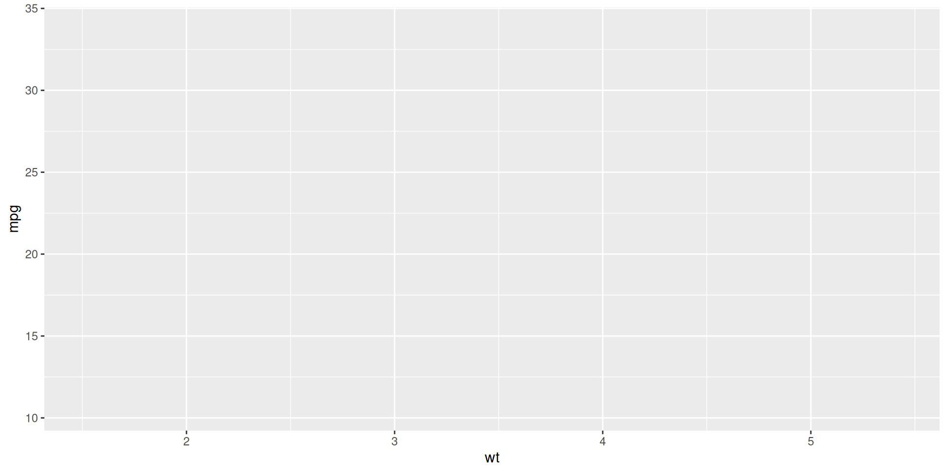
library (ggplot2)# Create the basic ggplot object with axes ggplot (mtcars, aes (x = wt, y = mpg))
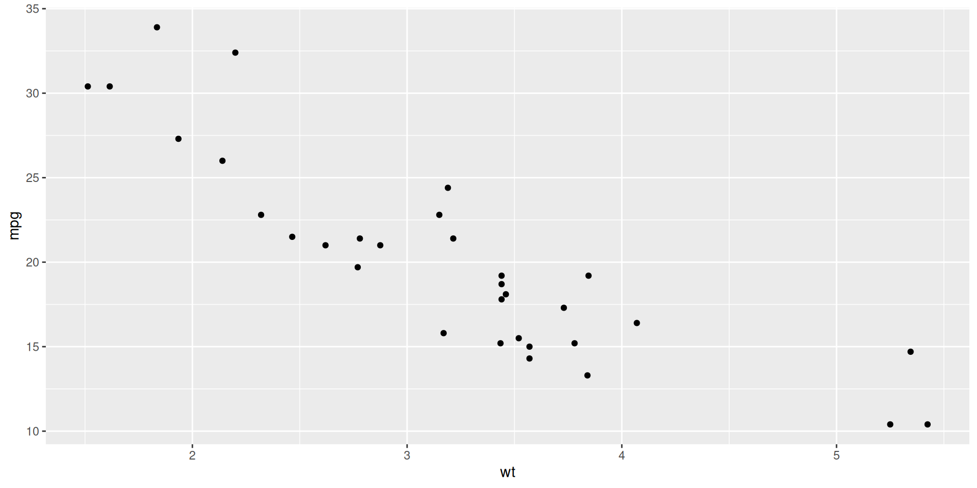
Step 2: Add Points
Add points to visualise individual observations:
# Add points to show the relationship ggplot (mtcars, aes (x = wt, y = mpg)) + geom_point ()
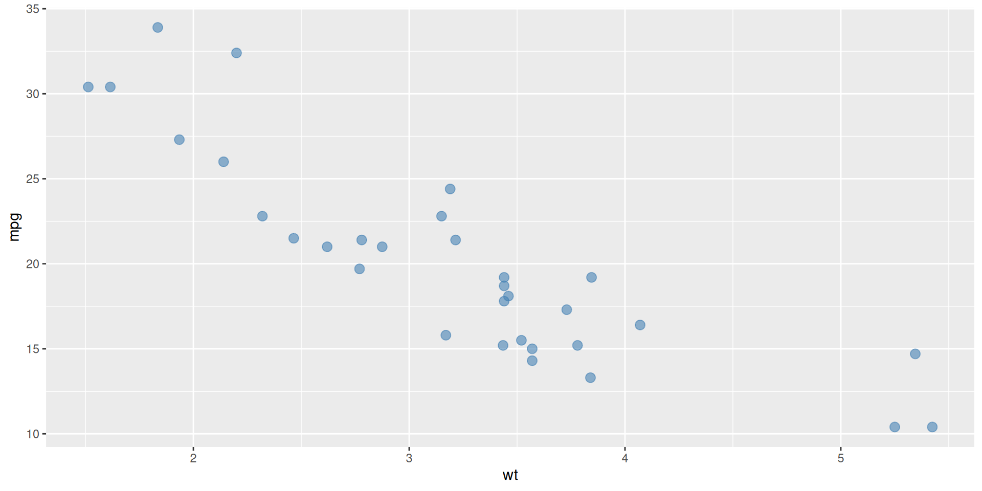
Step 3: Customise Points
Adjust size, transparency, and colour:
# Make points larger and semi-transparent ggplot (mtcars, aes (x = wt, y = mpg)) + geom_point (size = 3 , alpha = 0.6 , colour = "steelblue" )
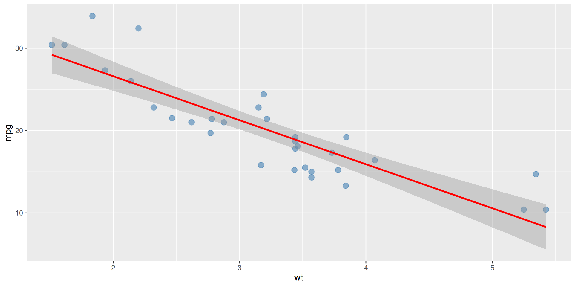
Step 4: Add Trend Line
Add a smoothing layer to show the pattern:
# Add linear regression line ggplot (mtcars, aes (x = wt, y = mpg)) + geom_point (size = 3 , alpha = 0.6 , colour = "steelblue" ) + geom_smooth (method = "lm" , se = TRUE , colour = "red" )
Step 5: Add Labels and Theme
Make it publication-ready with titles and formatting:
# Build the complete scatter plot <- ggplot (mtcars, aes (x = wt, y = mpg)) + geom_point (size = 3 , alpha = 0.6 , colour = "steelblue" ) + geom_smooth (method = "lm" , se = TRUE , colour = "red" ) + labs (title = "Fuel Efficiency vs Weight" ,subtitle = "mtcars dataset" ,x = "Weight (1000 lbs)" ,y = "Miles per Gallon" ,caption = "Data: Henderson & Velleman (1981)" + theme_minimal () + theme (plot.title = element_text (size = 14 , face = "bold" ))
Final Scatter Plot
View the complete publication-ready plot:
Bar Plots in R
Show counts or comparisons across categories
Step 1: Basic Bar Plot
Create bars for each category:
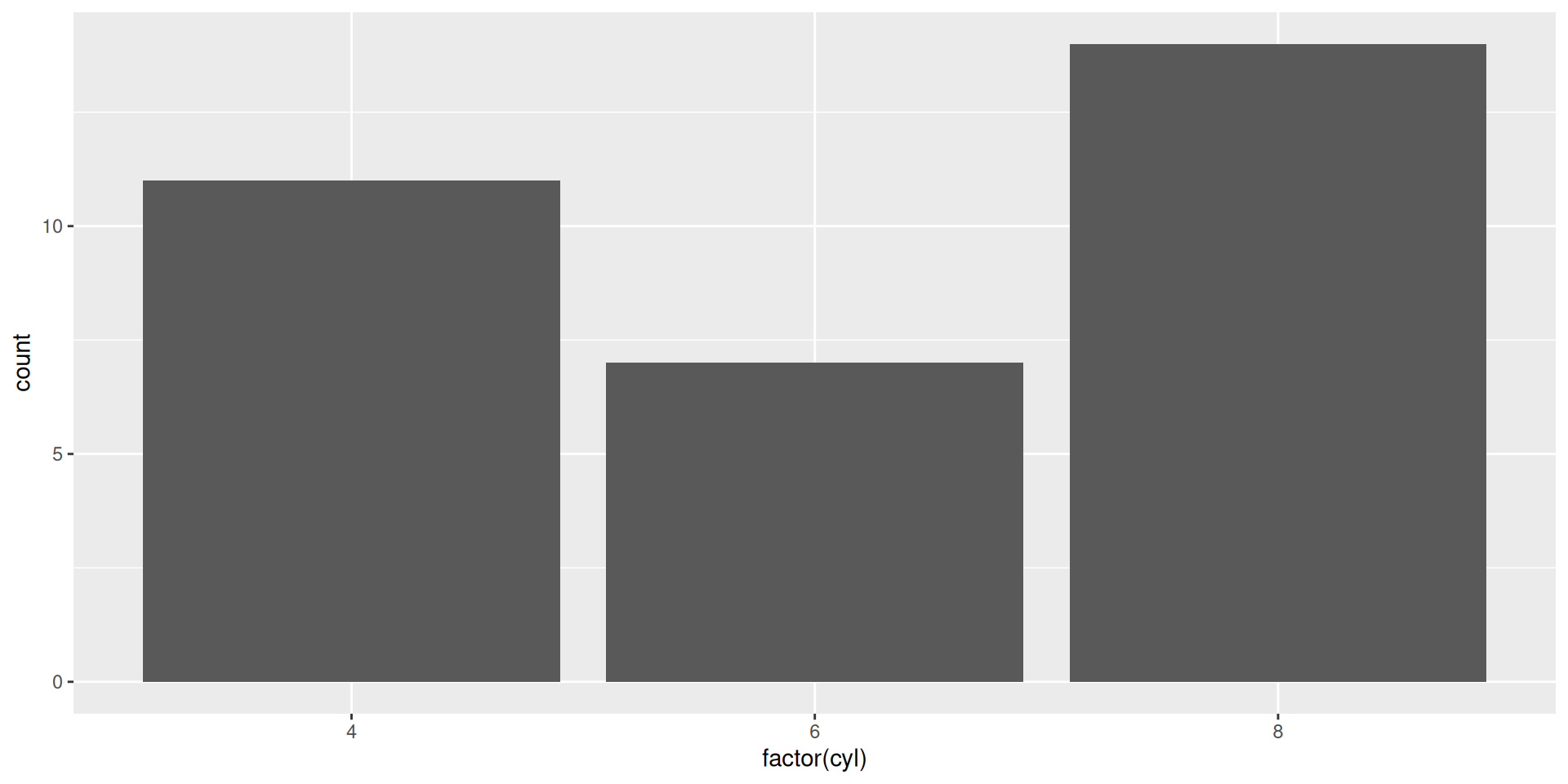
# Create basic bar plot ggplot (mtcars, aes (x = factor (cyl))) + geom_bar ()
Step 2: Add Colour
Customise the appearance with colours:
# Add custom fill colour ggplot (mtcars, aes (x = factor (cyl))) + geom_bar (fill = "steelblue" , colour = "black" , alpha = 0.7 )
Step 3: Add Labels
Add titles and axis labels:
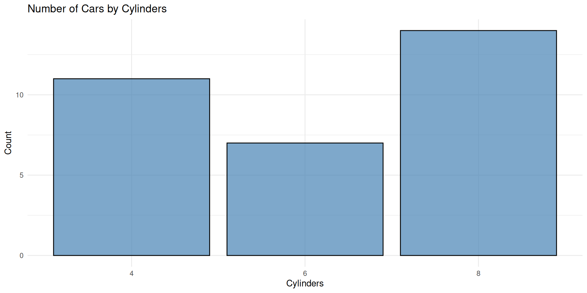
# Build the complete bar plot <- ggplot (mtcars, aes (x = factor (cyl))) + geom_bar (fill = "steelblue" , colour = "black" , alpha = 0.7 ) + labs (title = "Number of Cars by Cylinders" ,x = "Cylinders" ,y = "Count" + theme_minimal ()
Final Bar Plot
View the complete publication-ready plot:
Box Plots in R
Show distributions and identify outliers
Step 1: Basic Box Plot
Create a box plot to show distribution:
# Create basic box plot ggplot (mtcars, aes (x = factor (cyl), y = mpg)) + geom_boxplot ()
Step 2: Customise Box Plot
Add colours and improve aesthetics:
# Customised box plot with colour ggplot (mtcars, aes (x = factor (cyl), y = mpg, fill = factor (cyl))) + geom_boxplot (alpha = 0.7 ) + geom_jitter (width = 0.1 , alpha = 0.3 ) # Add individual points
Step 3: Add Labels
Make it clear and publication-ready:
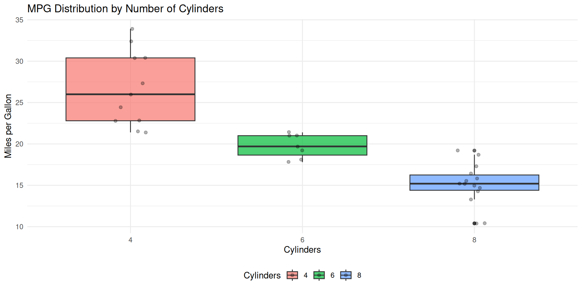
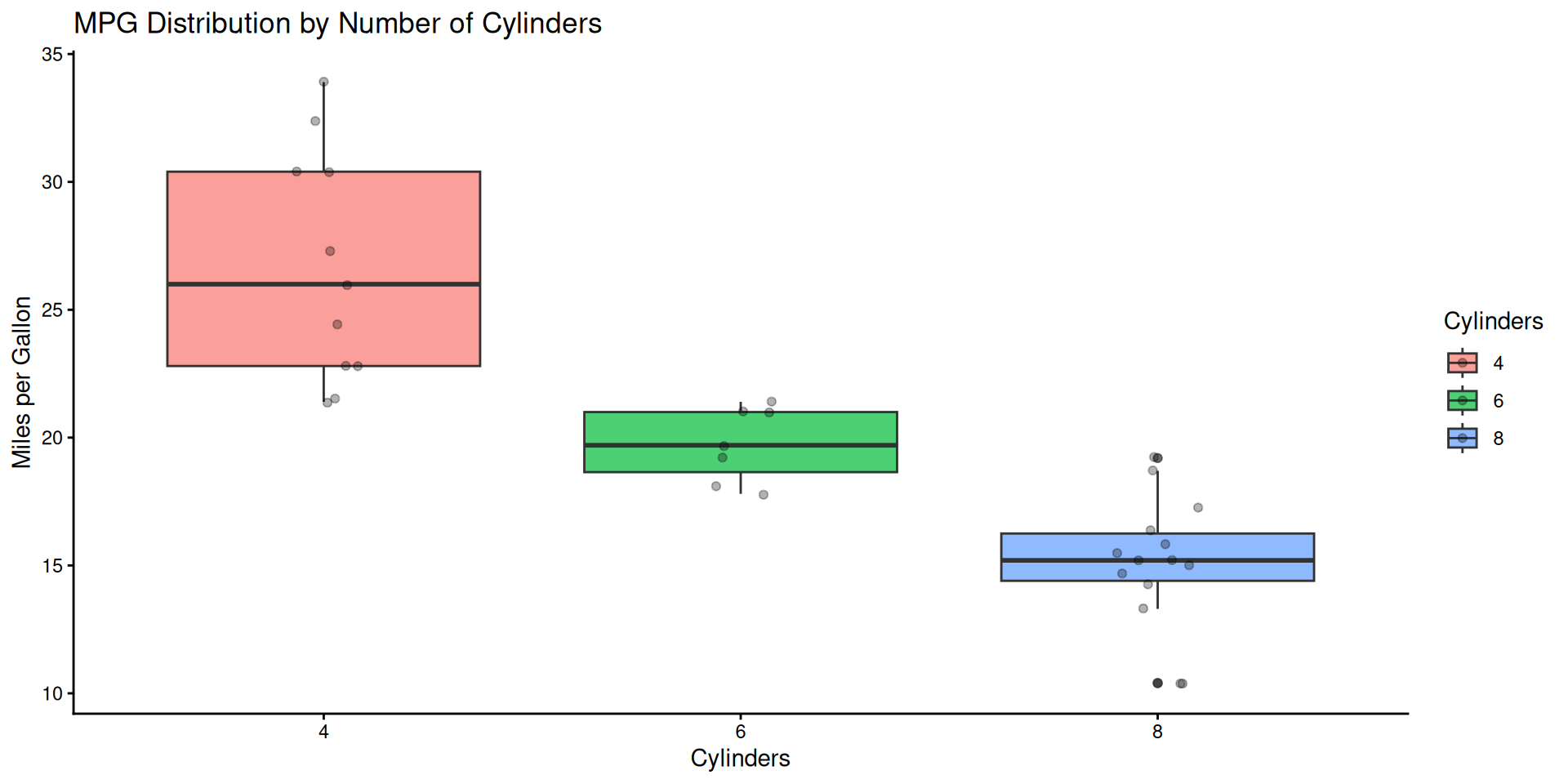
# Complete box plot with labels <- ggplot (mtcars, aes (x = factor (cyl), y = mpg, fill = factor (cyl))) + geom_boxplot (alpha = 0.7 ) + geom_jitter (width = 0.1 , alpha = 0.3 ) + labs (title = "MPG Distribution by Number of Cylinders" ,x = "Cylinders" ,y = "Miles per Gallon" ,fill = "Cylinders" + theme_minimal () + theme (legend.position = "bottom" )
Final Box Plot
View the complete publication-ready plot:
Using Plots in R
Plots can also be assigned to objects for further modification or saving:
# Save plot to object <- my_boxplot + theme_classic ()
Exporting Plots in R
You can save your plots using ggsave():
# Save the final plot as a PNG file ggsave ("final_plot.png" , plot = final_plot, width = 15 , height = 10 , units = "cm" , dpi = 300 )